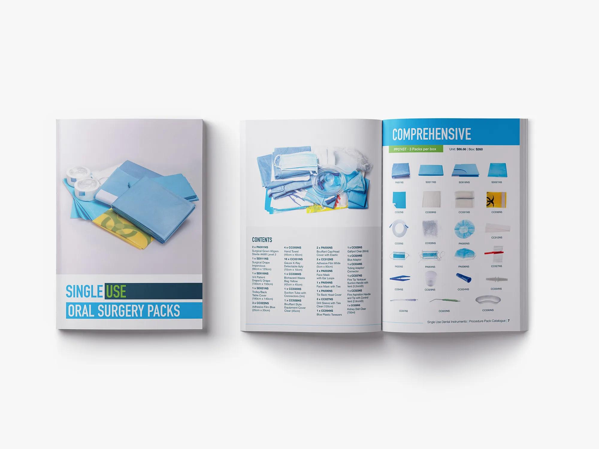
Brief
Redesign three product catalogues for Single Use Dental Instruments to reflect updated branding and a fresh visual direction. The goal was to improve usability and create a consistent, scalable design system that could grow with the product range — with focus on layout clarity, hierarchy, and a streamlined user experience across all sections.
Outcomes
The redesigned catalogues gave the sales team a professional, shareable resource they could confidently send to clients without relying on the website. By following best practices for layout and version control, updates became faster and more consistent. Removing pricing from the documents improved accuracy, reduced the need for frequent revisions, and extended the shelf life of each version.
Problems Solved
Version Confusion
Structured naming conventions eliminated confusion around which catalogue version was current, making collaboration and updates much easier for both myself and the sales team.
Excessive Load Times
The original catalogues exceeded 20MB. Image compression and optimised exports brought file sizes down significantly, solving long-standing issues with load times on self-hosted PDFs.
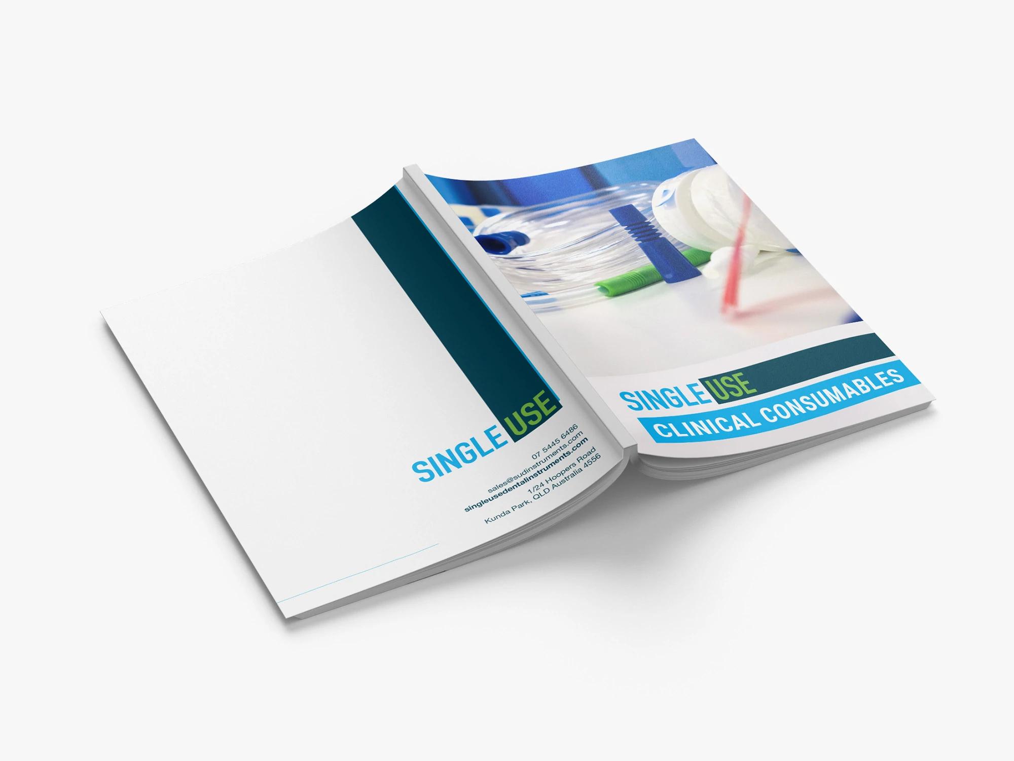
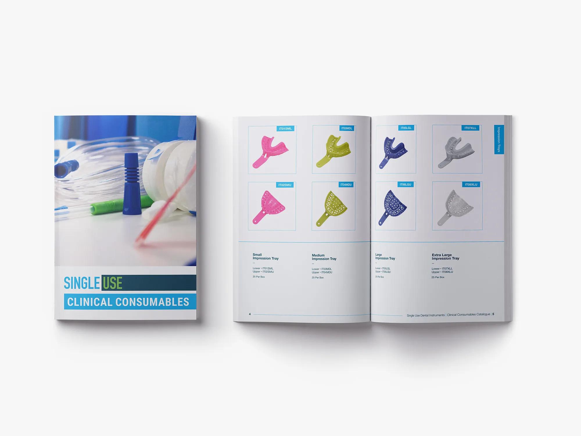
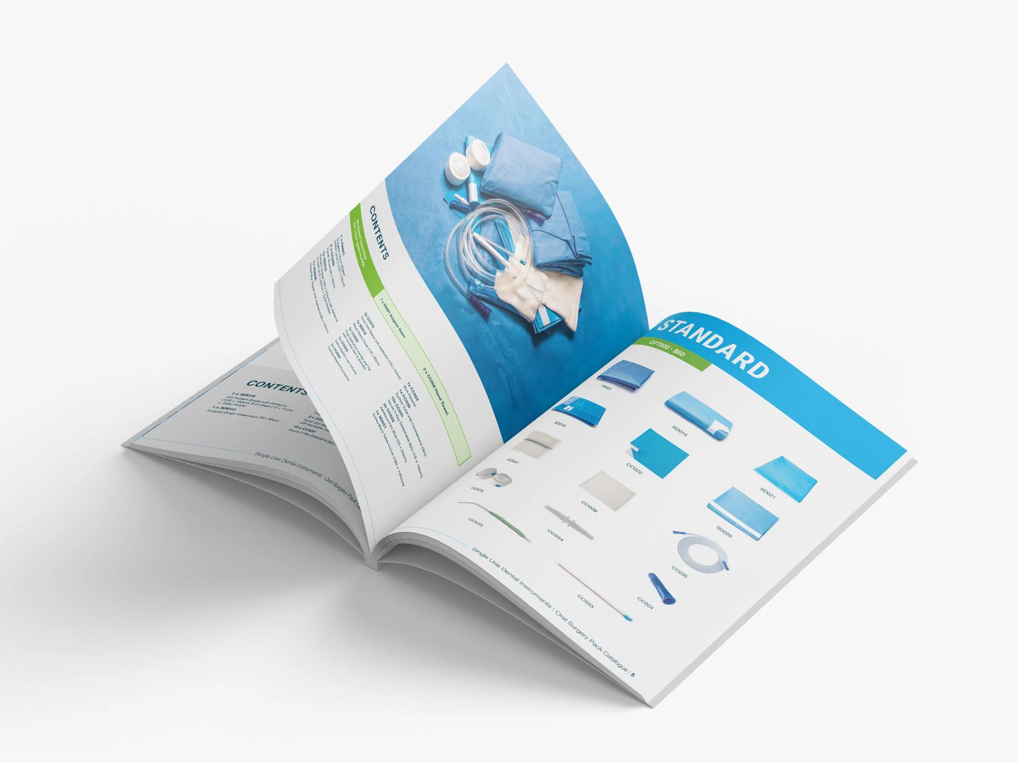
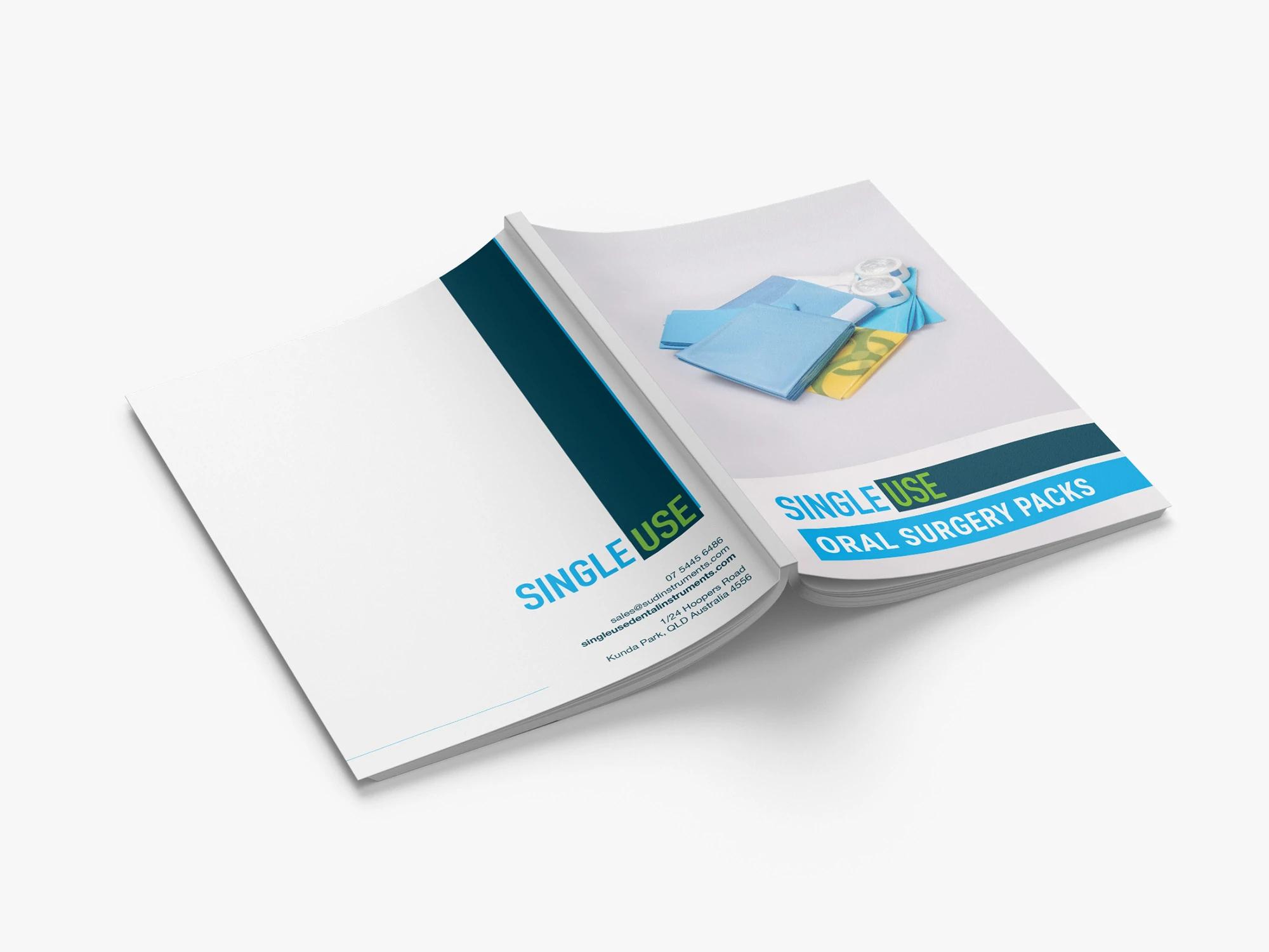
Confusing User Experience
A complete visual refresh improved readability and navigation — simplified layout, cleaner spreads, a more functional table of contents, purposeful use of colour, and thoughtful typography all contributed to a clearer, more digestible experience.